Bringing Stubios to Desktop
Context
Expanding a mobile experience to connect creators and fans on desktop.
Over ten weeks as a UX design intern, I adapted Stubios’s key experiences for larger screens, from discovering projects to exploring creator profiles. I also adapted shared components for desktop layouts and interactions.
- Duration
- 10 Weeks
Jan 2024 - Apr 2024 - Role
- UX Design Intern
- Team
- Director
Project Manager
Product Manager
Engineer Team - Tool
- Figma, Adobe Creative
Suite, Jira, Slack
Background
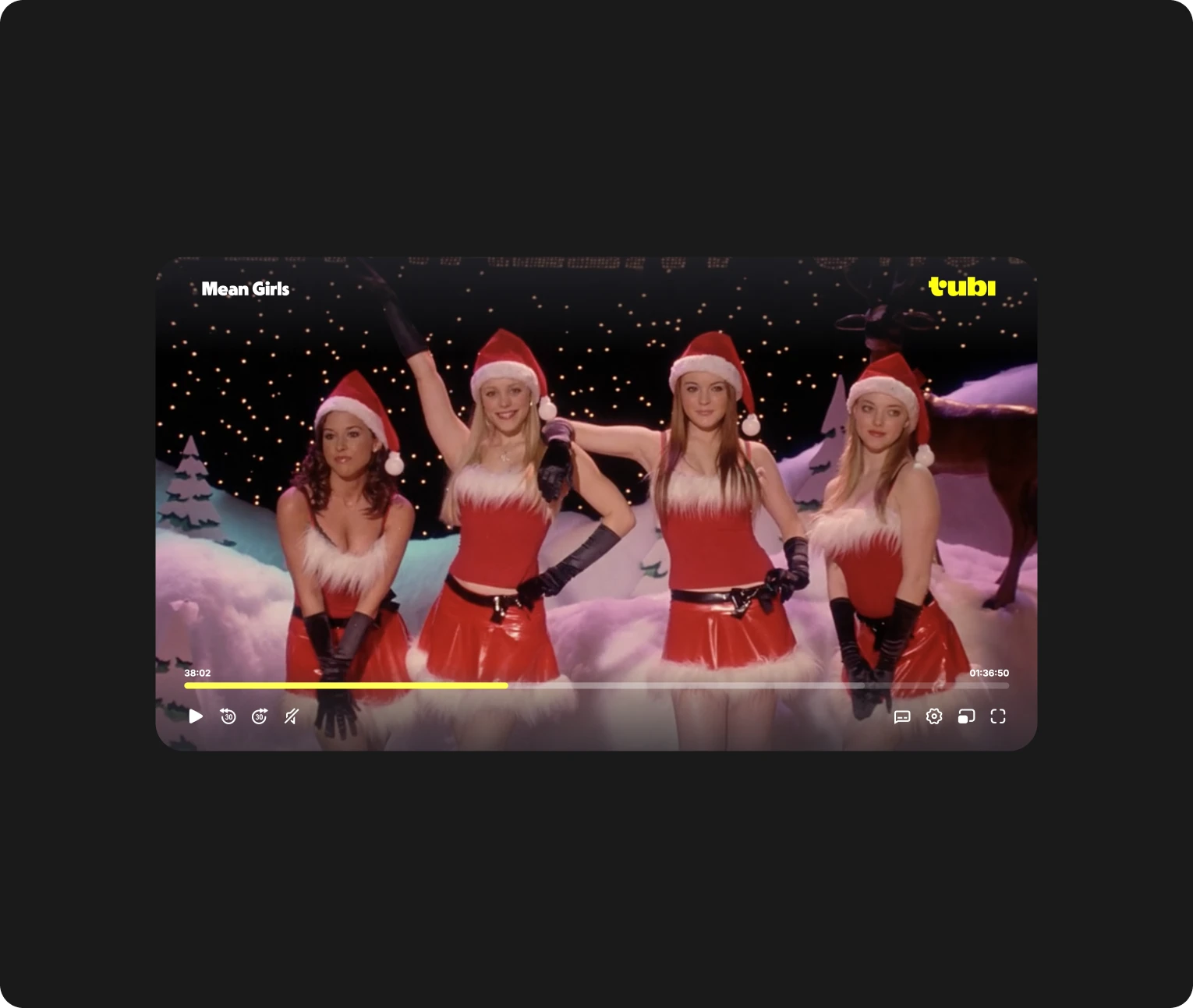
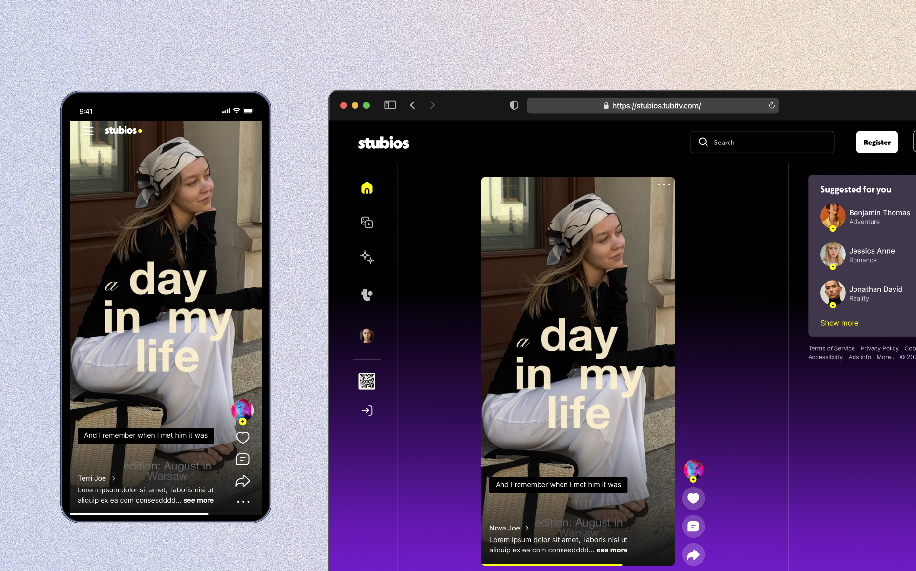
Stubios launched on mobile, while Tubi’s audience often watched on larger screens.
Tubi’s viewing data highlighted strong TV and desktop usage, creating an opportunity to bring Stubios closer to its audience’s existing habits.
Problem
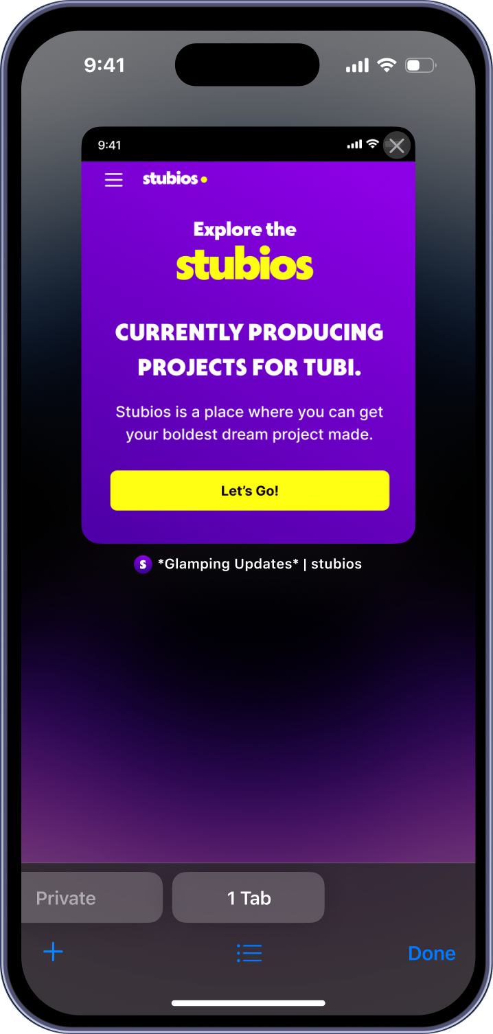
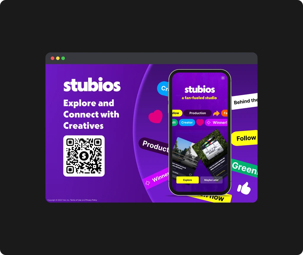
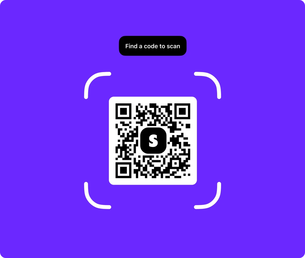
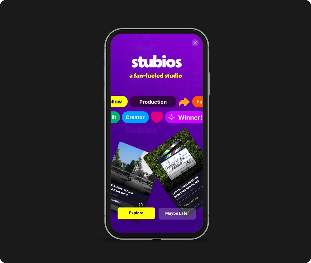
Desktop visitors reached a QR code instead of the product.
Users had to switch to their phones to continue. Simply stretching the mobile interface also produced awkward spacing and weak hierarchy, leaving desktop space poorly utilized.
Solution
Rethink the layout around how content should work on a larger screen.
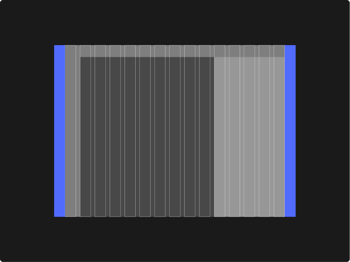
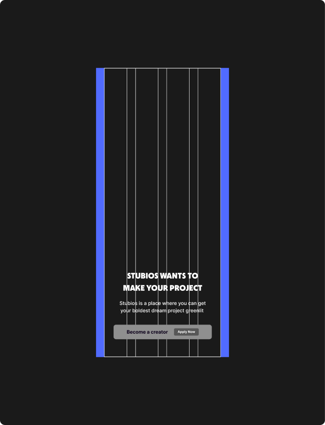
I adjusted content density, spacing, and hierarchy to make better use of desktop space. A responsive grid provided structure while allowing layouts to adapt across screen sizes.
Final Design
Desktop layouts for discovering projects and getting to know their creators.
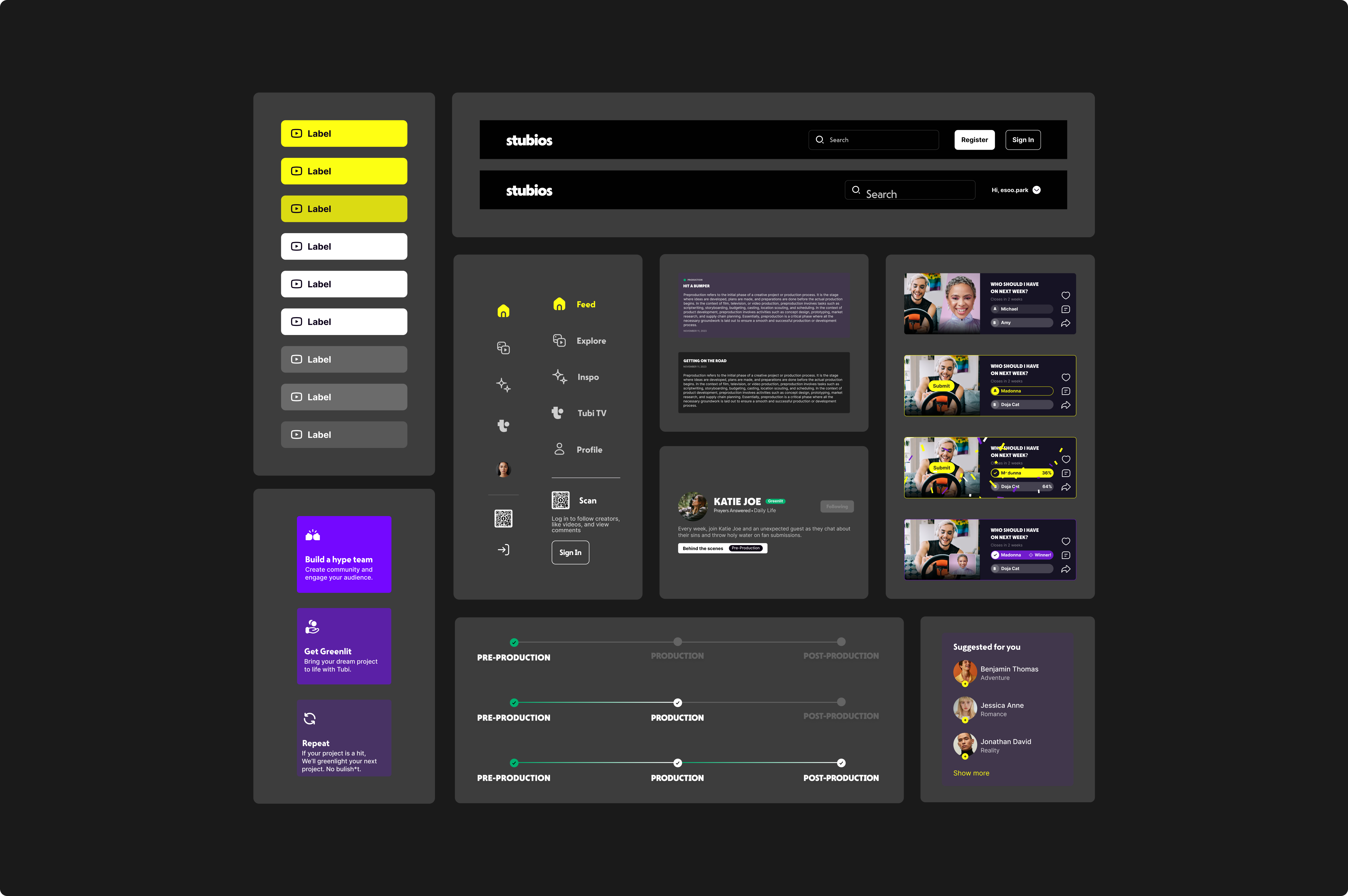
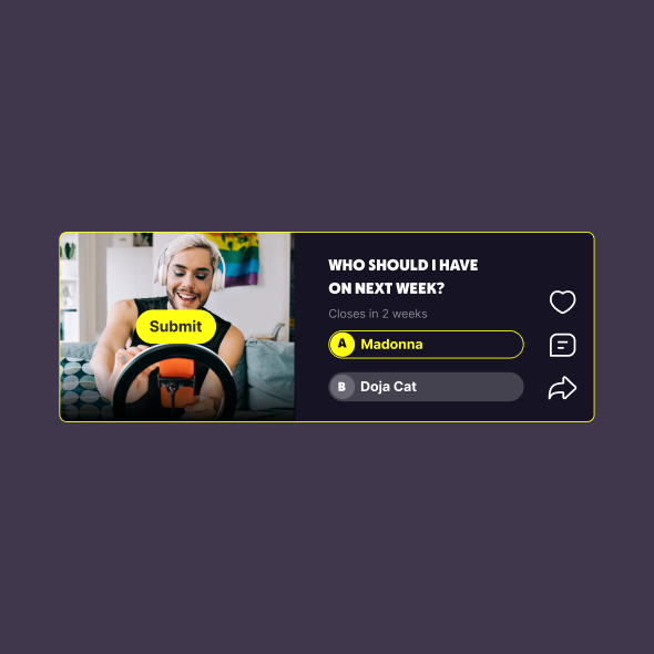
I redesigned the landing page, creator profiles, and Greenlight pages with clearer content grouping and desktop proportions. Shared navigation and reusable patterns kept the experience consistent across pages.
Impact
A desktop experience ready for implementation, with clearer guidance for engineers.
The redesigned pages established a foundation for Stubios’s desktop expansion. Reusable patterns and annotated specifications supported implementation and reduced developer collaboration time.
Reduction in developer collaboration time
There's a lot more to the story behind this design...
I'd love to walk you through it in a chat or interview!